added 26 characters in body
Source Link

Please make the introduction text not clash with the theming around it.

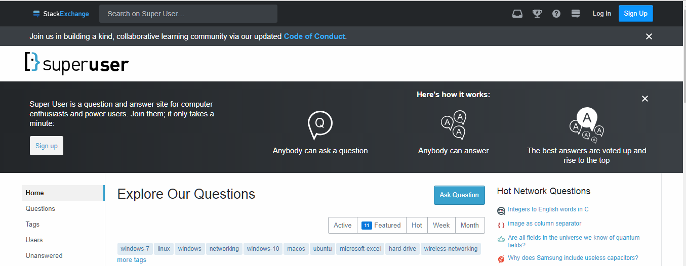
Here is the new theming:

Dark-Light contrast

The introduction text, explaining what the site is for and how it works, clashes with the normal color scheme. It goes dark-light-dark-light.

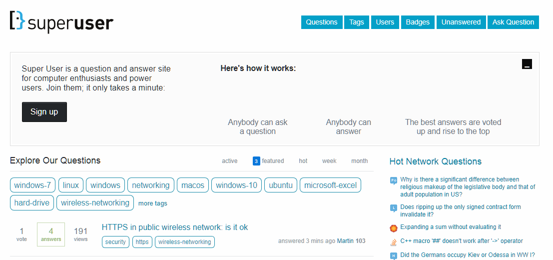
No contrast

The old version from the Web Archive (some of the images are broken) has good theming contrast. It goes dark-light (the dark part is the top bar which isn't in that picture).

I'd like to see the introductory info be changed to a light theme for a better look.
Source Link
Zackary
  • 543
  • 2
  • 9

Please make the introduction text not clash with the theming around it.

Here is the new theming:

Dark-Light contrast

The introduction text, explaining what the site is for and how it works, clashes with the normal color scheme. It goes dark-light-dark-light.

No contrast

The old version from the Web Archive (some of the images are broken) has good theming contrast. It goes dark-light (the dark part is the top bar which isn't in that picture).

I'd like to see the introductory info be changed to a light theme for a better look.