1

As mentioned on meta.stackexchange.com several months ago, all network sites will be getting updated themes. Super User is one of the first sites that will be updated. As such, I'm posting the design here so you can see how the new theming will be applied to your site.

I want to acknowledge that this will be a painful change for sites that have rich, custom themes. I want to reinforce that the theme changes are a required step to deliver ongoing value to the sites with as little friction as possible. We released changes for tag watching (aka favorite tags) this week and will be releasing a beta of custom question list functionality soon. The only way to make sure Q&A improvements are quickly available to all Q&A sites is to fix our themes.

To recap from the original post on themes:

Every Q&A site has its own theme. But there is great inequality in the level of theming that we support. A few (~10) get Cadillac treatment, some (<50) are more like a Honda, while most (~100) are a Yugo. The reality is we created a theming system that we didn't have the design resources to fully support, thus the inequity. In addition, as currently defined, our theming gets in the way of releasing new features on the sites.

In order to deliver the left nav, responsive design and future improvements to all sites we've created a more standardized way to support theming. This will reduce the burden of supporting designs as we make Q&A improvements. The result is that most sites will see an improvement in the level of theming that they can get. While some sites will see a reduction. All of Q&A (Enterprise, Teams, etc) will standardize on this new theming scheme.

- Ch-ch-ch-changes: Left nav, responsive design, & themes

Next steps

Schedule

  • Early July: Collect and respond to feedback from this post
  • Late July: Update the site

Feedback

Please review the mockups and feel free to provide constructive feedback in answers below. We aren't going to revisit the choices we've made around simplification, so it would be more productive to keep feedback focused on the application of the new theme scheme.

Note: I'm leaving on vacation later today, but didn't want to delay getting these designs posted. As such, I'll have limited time/ability to respond to feedback and comments until I return.

Enough talk, show me the money

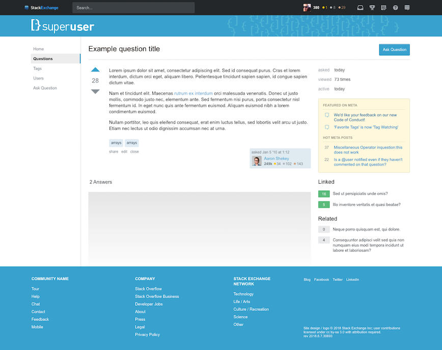
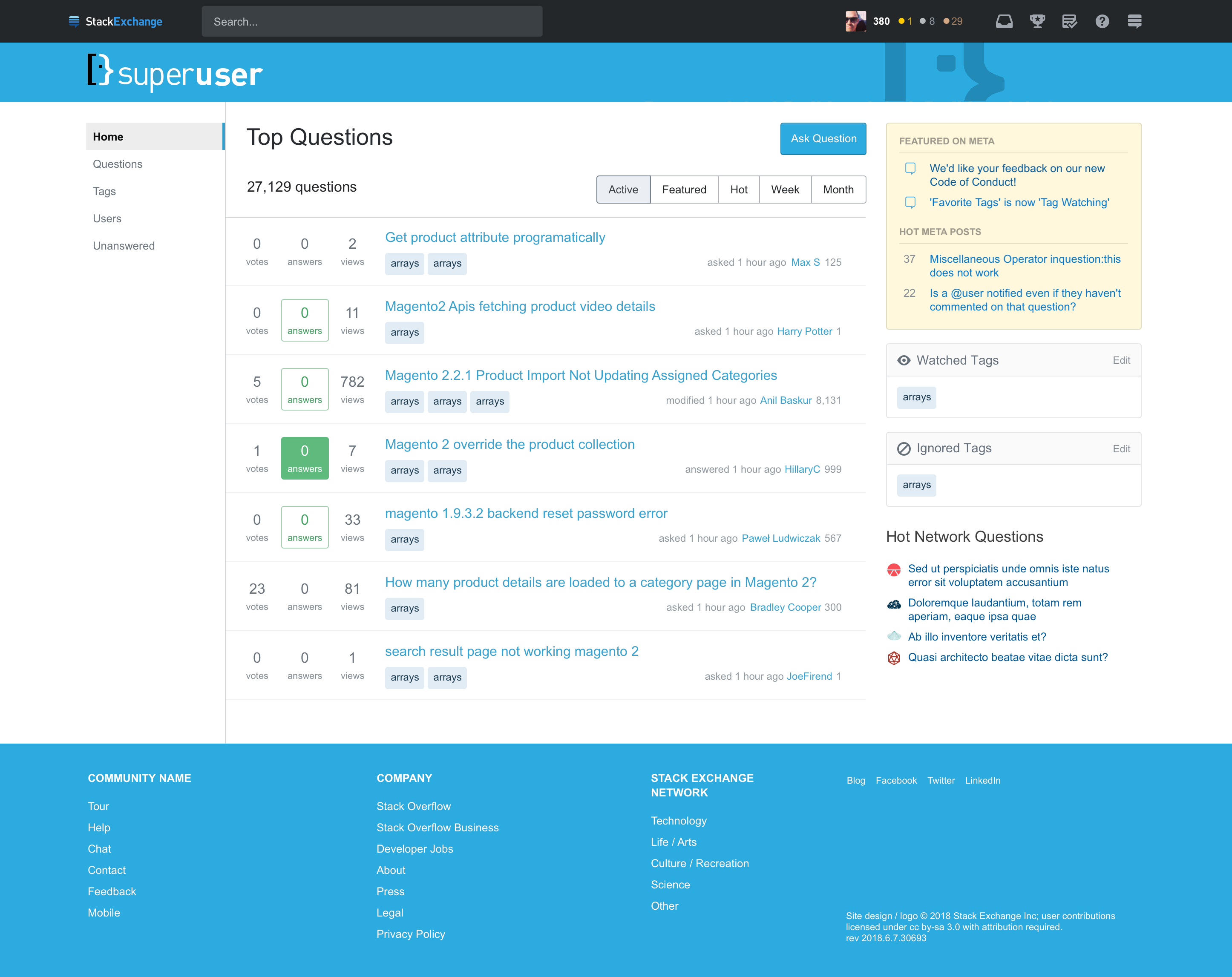
You can click on the mockups below to see the image in a larger format.

Super User

Super User home page

Super User question page

6
  • 14
    It looks too much like Meta Stack Exchange.
    – gparyani
    Commented Jul 9, 2018 at 18:39
  • 1
    @gparyani so, as mentioned in the post, why not give some constructive feedback on the parts of the theme we might be able to control? It clearly states that they are working on themes and theme support, so just saying "waaa, it looks like $OTHER_SITE$ :(" is rather short sighted.
    – Mokubai Mod
    Commented Jul 9, 2018 at 19:40
  • 3
    @Mokubai I already left a longer comment on the MSE question; I didn't want to be redundant.
    – gparyani
    Commented Jul 9, 2018 at 19:42
  • 1
    Can we please also get a mockup of how Meta Super User will look under the new design?
    – Mureinik
    Commented Jul 11, 2018 at 5:35
  • 1
    @Mokubai But it does look a lot like Meta Stack Exchange, and also like the new theme for beta sites, and it is a problem if sites look too similar. I don't know where the hyperbolic "waaa" in your comment came from? Commented Jul 13, 2018 at 8:09
  • @user568458 I was emphasizing that simply commenting "it looks like X" is rather unconstructive when being actively canvassed for feedback. It sounds a lot like crying over spilt milk while simultaneously refusing to do anything to help clean it up. Many of the answers below offer some constuctive criticism or at least point out specific problems that need to be fixed and why, if not actually how (though in many cases they do). Just saying it looks too much like something else is a pretty useless statement without qualifying why that is a bad thing.
    – Mokubai Mod
    Commented Jul 13, 2018 at 8:17

7 Answers 7

24

There's a related post on MSE here, and I encourage people to weight in there - I'm probably a lot more annoyed when I wrote it, a little later, and I don't see the point repeating it here.

As a long term user, and a moderator on SU, I'm pretty frustrated with the specific approach taken, and as a lot of folks pointed out, we got stuck with what's basically a beta theme. I'm frustrated, and actually a little angry with how this turned out, and I actually have been a fan of the new responsive layouts.

Having used MSE with the new theme, there's a few things our users are probably going to love. I currently use it in desktop view on my phone, and it just works, and as a mod, this is a very nice thing (The current theme is usable but less so). However as a whole, the theme is a disappointment.

Our theme though. Its... basically the generic theme, and the more I think about it, the less happy I am.

I'd ask you guys consider a black on white banner, more in line with the current theme (which lets us keep our bicoloured logo). The big issue I have with the current theme is, well... it quite literally dosen't seem to have anything to do with our site over the last near decade. We'd like to keep our identity.

Having looked through the existing themes, can we knock off what SF has, but with our site's blue over their dried LART residue red? or even what mathematics has, which is really close to what we have now.? I mean, this isn't going to take a massive amount of time, even compared to just throwing our name and logo on the beta/generic themes.

2
  • 10
    Okay, we screwed up. We will take another shot at the SU theme.
    – Joe Friend Staff
    Commented Jul 17, 2018 at 22:28
  • Ah. Thank you. That is appreciated
    – Journeyman Geek Mod
    Commented Jul 17, 2018 at 23:52
13

We reverted to the bi-color logo on the main site and removed the other "disjointed logos" on the site bar

Please keep the old bicoloured logo

Seriously. The new one looks bleak in comparison

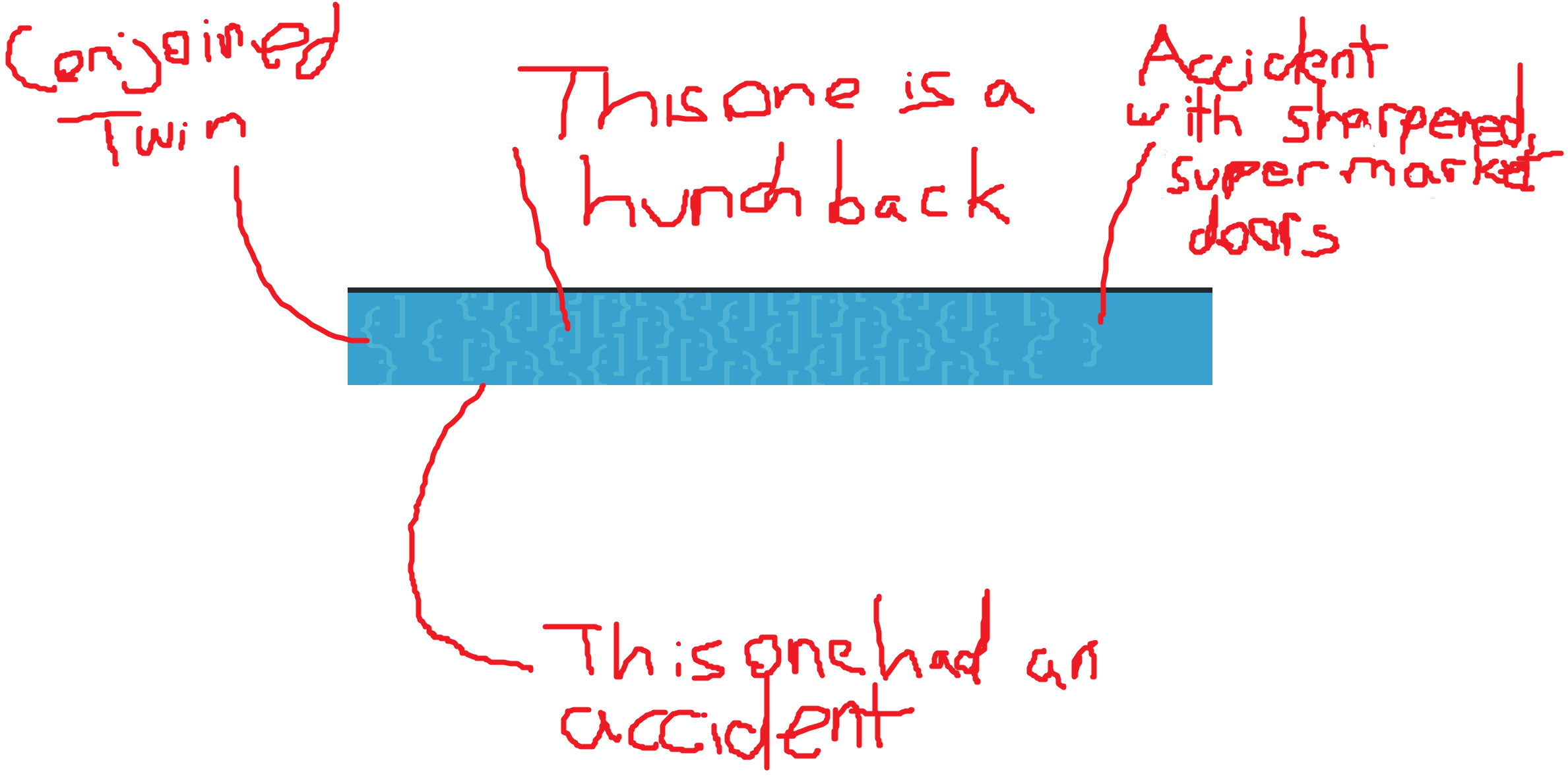
What's with the weird disjointed logos on the RHS?

As @Burgi correctly points out:

enter image description here

Update

Early July: Collect and respond to feedback from this post

LMAOOOOOOOOOOOO Totally bamboozled us

5
  • 2
    They did collect feedback. They agree with allquixotic's feedback. :-)
    – fixer1234
    Commented Jul 16, 2018 at 11:48
  • 3
    We are collecting feedback. That's what this post is for. Keep bi-color logo. Check.
    – Joe Friend Staff
    Commented Jul 17, 2018 at 22:30
  • @JoeFriend also make sure that the logo isn't deformed! That should be the big take away.
    – Burgi
    Commented Jul 18, 2018 at 10:11
  • 1
    @Burgi Got it. Designers should mangle the logo even more. ;)
    – Joe Friend Staff
    Commented Jul 18, 2018 at 15:54
  • @JoeFriend Rather than editing someone else's answer, this should go into the main question, no?
    – slhck
    Commented Aug 10, 2018 at 6:30
11

I also posted a response on Meta. The trashed logo and the vomit-inducing noise serving as artwork, as covered in other answers, seriously degrade the site's image and give it an amateurish appearance.

I can only assume that whoever worked on the Super User redesign had an axe to grind with this site. Aside from the general changes that affect all sites, many aspects of the Super User customization are actively bad; purposeless degradations rather than improvements.

Super User was not a site with "Cadillac" treatment; it was always a simple site. The changes shown are customizations for customization sake, not required by the theme change, and are very undesirable. Using the stock theme with the unaltered original site logo would be better than trashing the site as shown.

1
  • 5
    I absolutely cannot stand the new layout. I currently will keep it disabled, until I am forced, into using it. I agree that the proposed changes are absolutely horrible.
    – Ramhound
    Commented Jul 11, 2018 at 3:28
10

Here's a straight copy and paste from my answer on the Meta.SE thread:

Superuser

I think brand colouring and identity is important. I have slightly tweaked the proposed Superuser theme to use the on-brand colour from the colourised Superuser logo:

Superuser logo

The right-hand side logo mosaic, doesn't really represent the Superuser logo that I am familiar with, the logos are disjointed and it looks like they've just been plastered wherever the designer felt was good enough. I opted to replace that with a desatured closeup of the most familiar parts of the SU logo. Additionally, I have returned the dual colours back to the left-hand side logo (even though it's really black and white).

Superuser theme redesign

4
  • 1
    That's a nice mock-up, but I still think it's too close to the default and MSE themes.
    – robinCTS
    Commented Jul 13, 2018 at 10:31
  • Thanks for the mockups. I'll provide them to the designers as a starting point.
    – Joe Friend Staff
    Commented Jul 17, 2018 at 22:28
  • @JoeFriend Appreciate the response. I'd like to apologise for my tone of the message as well. It was pointed out to me that I had been less than constructive in my analysis of the original designers work. Commented Jul 17, 2018 at 22:43
  • The reality is that they are going to have to pump through a long list of sites (170+) before we are done with this effort. And, they aren't "invested" in the sites the same way you all are. So, that is why we have the comment period. The feedback really is appreciated, it's just easier to take it when it is offered with a little love. ;)
    – Joe Friend Staff
    Commented Jul 17, 2018 at 22:52
9

I think it sucks.

The most important thing, in my opinion, would be to keep the current coloured logo.

I've added a related post on MSE with a couple of mock-ups that keep the current logo and are distinctly different from the default and MSE themes.

7

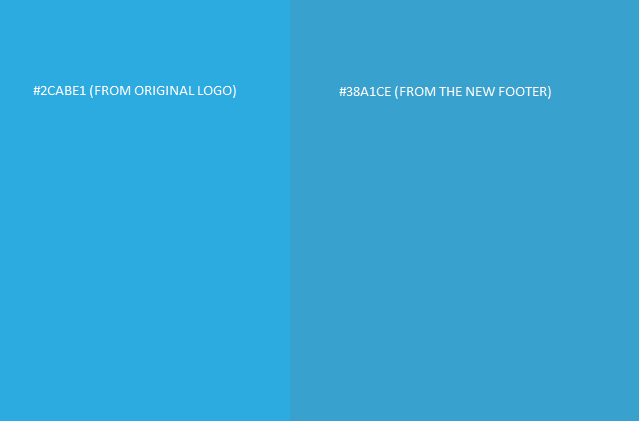
I like the layout of the new site but the colours seem too generic and "off-brand" for one of the trilogy sites.

I feel a much darker blue would be better. I have made an image for comparison:

enter image description here

I'm not a fan of the multiple corrupted logos in the top right. I would be much happier if these all lined up correctly.

I am a little cynical as to what our protests and comments can do at this point. I will still use the site regardless, I'll just be a little grumpier each time I see the logos...

1
  • +1 for grumpiness. Without it your stories would be boring :P Commented Jul 10, 2018 at 13:54
-6

Looks Good To Me (LGTM).

Doesn't seem like a very radical change for our site, other than making it look more like the Windows 10 start menu with the pastel colors (which may be a good or a bad thing, debatable whether we're officially/unofficially "the Microsoft.Stackexchange site".

Welcome to Super User! ;-)

1
  • 1
    The blue personally offends my eyes for some reason (it's very glarey in this environment) but other than that I don't notice very much difference to the current site. Maybe if I deliberately compared them side by side I might, but as the new one comes in, the old one will go away and I won't remember it anyway. I genuinely don't spend enough time looking at the colours or borders of the site to tell you what they currently look like. Commented Jul 10, 2018 at 13:56

You must log in to answer this question.

Not the answer you're looking for? Browse other questions tagged .