5

We rolled out the new site theme for Super User. It is now live.

What new theme?

If you're like, "What the heck are you talking about?", then you should read the Meta Stack Exchange post entitled Rollout of new network site themes (and maybe the posts it links to for the full background).

Your help needed

You are one of the first sites to get a new, unified theme. I previously posted the designs for theme in meta. The feedback given to that post was considered prior to rolling out the theme. Please help us look for issues/bugs and post the details (including images where needed) as an answer below.

If you have concerns or issues regarding the left nav then this Meta Stack Exchange post is the right place for feedback. If you have issues with any functionality that is unrelated to the new theme, then please post a new question.

8
  • 1
    Please forgive me if this has been asked before, but in the new Super User site theme what does the gold/beige background color behind certain questions signify? i.stack.imgur.com/IDb5i.jpg
    – Run5k
    Aug 9, 2018 at 16:37
  • 1
    @Run5k I believe they are your watched tags, with the exclusion that the current tag you are examining isn't counted. You have those questions highlighted because some of the other tags are watched.
    – Mokubai Mod
    Aug 9, 2018 at 16:56
  • 1
    @Mokubai that seems to be the case. Thanks for your feedback.
    – Run5k
    Aug 9, 2018 at 16:59
  • 2
    It feels like our feedback on the new theme was ignored in the previous question. I have said it before, I hate the new theme, I already provided my thoughts on that subject in the past.
    – Ramhound
    Aug 9, 2018 at 17:10
  • I'm confused. Where do I post a bug in the new theme that is not related to the left nav?
    – confetti
    Aug 10, 2018 at 5:02
  • Left pane eats too many space. I'd recommend to look on a theme used on ru.stackoverflow.com. The links posessed on the left pane of your theme are moved to upper static pane. In practice it is more usable.
    – Akina
    Aug 10, 2018 at 5:25
  • @confetti as an answer to this post I would assume. Aug 11, 2018 at 17:23
  • It's not bad. I don't like how much space the minimal left-side nav takes up, and that the primary identity is StackExchange, not SuperUser. But, those are minor quibbles. It's adequately designed and the new layout hasn't broken anything I put too much value in. Aug 15, 2018 at 22:39

6 Answers 6

8

The updated Super User layout has rolled out. Some things will take getting used to, but one item is a confusing placement.

The question title is essentially in a box. The Ask Question button is inside the same box. That isn't a big problem with a short title. But with a long title, the Ask Question button becomes part of the title. Here's an example:

enter image description here

The title reads:

Converting non-numeric date to individual month,day, year components, and combining into one cell as datevalue

That is a disservice to questioners, and makes the button harder to find when there is a long title.

Suggestions:

  • The site control buttons that have nothing to do with the thread should be clearly separate from the thread content. A better placement would be in the site title bar, centered over the question "column".

  • Another option: since someone seems convinced that the logical place for site navigation is in a big honking column eating the left side of the screen and always visible, stick it there. The Ask Question button is site navigation and should logically be in the place where site navigation is located. It will always be visible, and as a button, will be even more visible than the text links. And since it floats, it won't be out-of-sight, out-of-mind when newbies get the urge to post a new question as an answer.

  • Another alternative: everything in the thread is contained in the center column, except for the title. The title fills a space that also serves as a heading for the right-most column. That column has a list of thread-related posts in it, but buried within unrelated site content. If thread-related content is going to be in the right column, it should logically be at the top, right under the thread statistics, as the first thing you see. People are often unaware that it's even there because it's surrounded by unrelated content.

    Second, separate the center and right columns with a vertical rule, similar to what separates the navigation links on the left. The left column is wider than it needs to be, so the extra space for the rule can be taken from there. Run the rule all the way to the top of the box containing the title. Confine the title to the space over the center column, because that's all it applies to anyway. That will leave the Ask Question button in a clearly isolated space that is readily visible.

2
  • I disagree that this is how the question title is actually read, but I agree that we can do better here. This is by design for now, but will be something I'd like to improve on in the future. Aug 17, 2018 at 18:42
  • Point 2 makes sense, it's a CTA, Put it in the Left-Nav or on the top bar.
    – Robotnik
    Aug 22, 2018 at 3:24
5

Wow, it actually works better on my weird monitor setup of 2-3 really narrow windows. To be honest can hardly tell and will have forgotten shortly.

Thanks :)

4

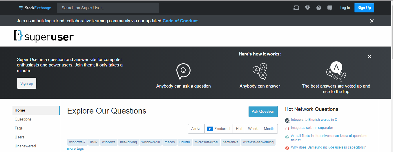
Please make the introduction text not clash with the theming around it.

Here is the new theming:

Dark-Light contrast

The introduction text, explaining what the site is for and how it works, clashes with the normal color scheme. It goes dark-light-dark-light.

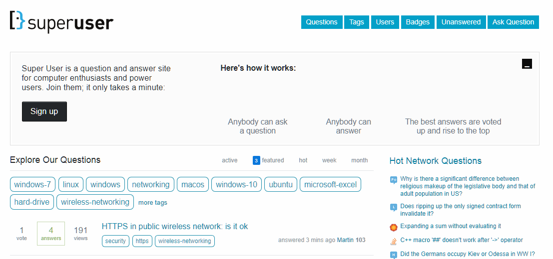
No contrast

The old version from the Web Archive (some of the images are broken) has good theming contrast. It goes dark-light (the dark part is the top bar which isn't in that picture).

I'd like to see the introductory info be changed to a light theme for a better look.

3

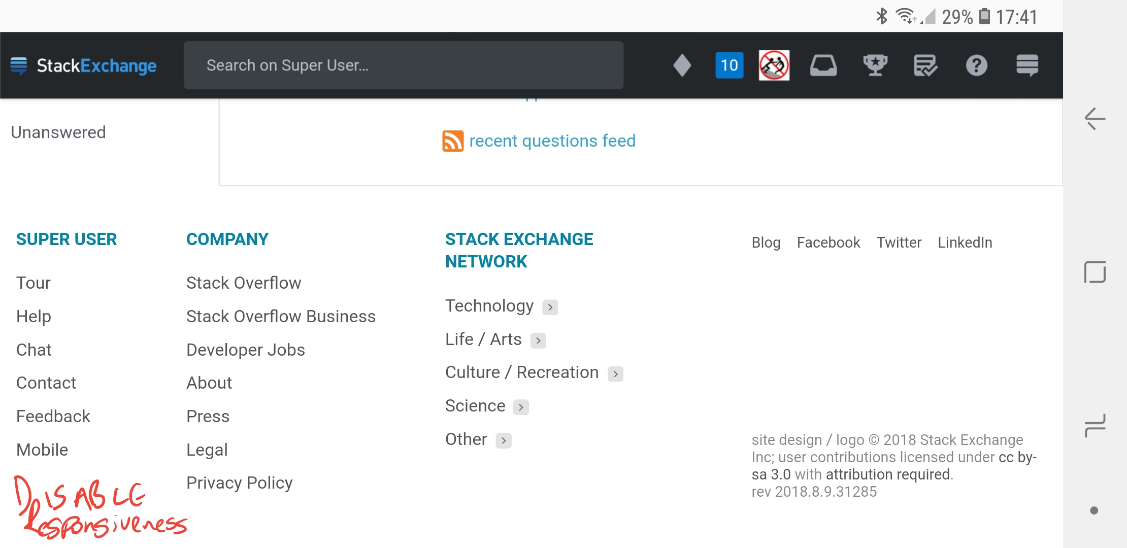
Responsiveness is always enabled and there is no link to disable it

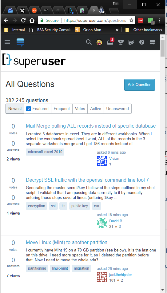
enter image description here:

What I'd really like is to be able to disable the responsive "change depending on your real estate" and always just have the left bar and main area, without the bar on the right.

Perhaps a way to say "I always want to see x and y... but if you can fit z in then go ahead knock yourself out."

We could call it "amenable" mode.

1
  • This should be fixed! Thanks for pointing it out! Aug 10, 2018 at 20:52
2

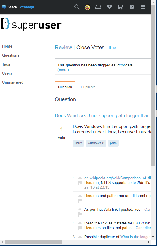
Responsiveness is a work in progress. It is likely that we will be redesigning review queues, profiles and mod tools before making them responsive. No time table for that work yet.

It's not resizing at all in review queues:

enter image description here

However looks fine on the main site view:

enter image description here

1
  • Yep. Not all views are responsive. This is a work in progress. See details here.
    – Joe Friend
    Aug 9, 2018 at 15:55
1

The logo has a very inconsistent baseline:

Enlarged image of the logo

You must log in to answer this question.

Not the answer you're looking for? Browse other questions tagged .