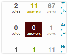
The "0 Answers" style on SuperUser looks horrid/out of place.
You know the one I'm talking about, the big burgundy box of badness.

The "0 Answers" style on SuperUser looks horrid/out of place.
You know the one I'm talking about, the big burgundy box of badness.

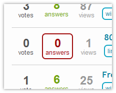
It's good that it's noticeable, but bad that it doesn't appear to fit well with the rest of the site. I'd prefer to see a lighter shade used, and used on the text and border rather than the background.

I disagree! I think questions without answers should look out of place. It's a community focused on asking and answering questions - no answers strikes me as something that should stand out.
On my monitor, it doesn't look black, it looks like a really deep burgundy.
Regardless, I think it could be made to stand out without clashing. I'd suggest trying something in the yellows.
Agreed: It's way too dark! Change the value (as in HSV) on the burgundy to be a little lighter.