3

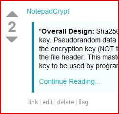
Well, it appears they've been revamped (after some here mentioned they were a bit too subtle.) What do you guys think of them now? Too pronounced? Perhas the blue bar should be washed out a bit more...Either way, it's definitely an improvement over the almost-non-detectable-background from before.
alt text

6 Answers 6

7

At first I thought there was something wrong with my computer, but now I actually like them because they actually bring out the quotes a lot better. I don't think it's the -best- idea, but it's a lot better than trying to guess where the quotes are.

4

I like them.

I would like to see more difference between code and quotes (beyond code getting a fixed width font), though.

1

I'd rather see them suspended in some sort of dark gray box, that is just too distracting for me right now.

0

I would also like to see something similar here on Meta.

0

I agree with TheTXI, I actually like the hard highlight, as on some LCDs the greyish is too subtle to be distinguished.

6
  • What is even up with your DisplayName?
    – random
    Commented Oct 13, 2009 at 14:42
  • 1
    meta.stackexchange.com/questions/25676/…
    – perbert
    Commented Oct 13, 2009 at 15:14
  • Upvoted that comment too and didn't even cotton on then.
    – random
    Commented Oct 13, 2009 at 15:22
  • @random: you've set adblock to block my name, haven't you?
    – perbert
    Commented Oct 13, 2009 at 15:28
  • Adblock? Isn't that a non-Opera thing?
    – random
    Commented Oct 13, 2009 at 15:52
  • Its a non lynx thing
    – perbert
    Commented Oct 13, 2009 at 16:03
0

Maybe keep them for the quotes but remove them from code. It is way too distracting to be of any use.