16

It's the time of the year again, namely it is December 2013, and so we shall now refresh our Community Promotion Ads for the new year.

What are Community Promotion Ads?

Community Promotion Ads are community-vetted advertisements that will show up on the main site, in the right sidebar. The purpose of this question is the vetting process. Images of the advertisements are provided, and community voting will enable the advertisements to be shown.

Why do we have Community Promotion Ads?

This is a method for the community to control what gets promoted to visitors on the site. For example, you might promote the following things:

  • cool desktop and tablet apps
  • the site's twitter account
  • script packs or power tools
  • cool events or conferences
  • anything else your community would genuinely be interested in

The goal is for future visitors to find out about the stuff your community deems important. This also serves as a way to promote information and resources that are relevant to your own community's interests, both for those already in the community and those yet to join.

Why do we reset the ads every year?

Some services will maintain usefulness over the years, while other things will wane to allow for new faces to show up. Resetting the ads every year helps accommodate this, and allows old ads that have served their purpose to be cycled out for fresher ads for newer things. This helps keep the material in the ads relevant to not just the subject matter of the community, but to the current status of the community. We reset the ads once a year, every December.

The community promotion ads have no restrictions against reposting an ad from a previous cycle. If a particular service or ad is very valuable to the community and will continue to be so, it is a good idea to repost it. It may be helpful to give it a new face in the process, so as to prevent the imagery of the ad from getting stale after a year of exposure.

How does it work?

The answers you post to this question must conform to the following rules, or they will be ignored.

  1. All answers should be in the exact form of:

    [![Tagline to show on mouseover][1]][2]
    
       [1]: http://image-url
       [2]: http://clickthrough-url 
    

    Please do not add anything else to the body of the post. If you want to discuss something, do it in the comments.

  2. The question must always be tagged with the magic tag. In addition to enabling the functionality of the advertisements, this tag also pre-fills the answer form with the above required form.

Image requirements

  • The image that you create must be 220 x 250 pixels
  • Must be hosted through our standard image uploader (i.sstatic.net)
  • Must be GIF or PNG
  • No animated GIFs
  • Absolute limit on file size of 150 KB

Score Threshold

There is a minimum score threshold an answer must meet (currently 6) before it will be shown on the main site.

You can check out the ads that have met the threshold with basic click stats here.

1
  • Do the ads actually get displayed somewhere? I often try to visit superuser.com when logged and unlogged, but I have never seen any of the ads below appear. Commented Jul 8, 2014 at 2:42

20 Answers 20

37

Q&A site for people seeking specific software recommendations

26

KeePass Password Safe

2
  • 11
    The logo looks a little pixelated to me. You can find a hi-res one here: i.imgur.com/tUaSb5I.png
    – slhck
    Commented Dec 6, 2013 at 15:11
  • 1
    Fixed, you can upvote it now ;)
    – gronostaj
    Commented Dec 14, 2013 at 20:35
16

Follow us on Twitter!

1
  • This is a demonstration post to indicate how this should look when an ad is posted. It also doubles as your twitter ad, but it's up to you if you wish to promote it by voting.
    – Grace Note StaffMod
    Commented Dec 6, 2013 at 9:41
16

Git — fast version control

12

Git — fast and easy branching

8

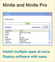
Ninite - Simple Unattended Installation and Patching

1
  • 3
    Windows XP is outdated now, and the window looks inactive rather than active. Instead, use a window style from Windows 8.1 and make the window look active.
    – gparyani
    Commented Aug 1, 2014 at 0:07
4

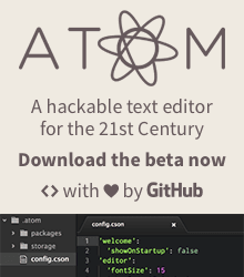
Atom • a 21st century text editor with a web-based core, Node.js integration, modular design, and infinite expandability

1
  • Mouseover: Atom • a 21st century text editor with a web-based core, Node.js integration, modular design, and infinite expandability
    – evan.bovie
    Commented May 1, 2014 at 0:40
2

nginx — high-performance web-server for accelerated web infrastructure

1
  • 6
    High performance at the cost of readability? A better font this ad could use. Commented Dec 27, 2013 at 0:09
2

Connecting to every server

1
  • Mouseover: Connecting to every server
    – evan.bovie
    Commented May 1, 2014 at 0:53
1

mdoc.su — short manual page URLs, a deterministic URL shortener for BSD manual pages, written in nginx.conf

1

BXR.SU — Super User's BSD Cross Reference — BSD Source Code Search Engine over FreeBSD, OpenBSD, NetBSD and DragonFly BSD kernel and userland source trees, based on OpenGrok, powered by nginx and regular expressions

4
  • 5
    Use a different front for the top line. Looks outdated, in my opinion.
    – studiohack
    Commented Dec 20, 2013 at 23:55
  • @studiohack, thanks for your comments, I've changed the top line font. Also in the process, I've moved from using an ad-hoc method with Pages to using Keynote, so, I've also decided to re-arrange the objects for better fitting, and to accommodate a bigger size. The OpenGrok logo and the BSD daemon are scaled down exactly 2x now, DragonFly is scaled down just a little over 4x, and OpenBSD/NetBSD are scaled down exactly 10x and 12x, respectively.
    – cnst
    Commented Dec 21, 2013 at 1:39
  • Also removed antialiasing from the top title, and added a subtitle. DragonFly is now scaled almost exactly 4x (can't really scale it 4 times, though, since the logo is of awkward size (519x318, I went with 130x80)).
    – cnst
    Commented Dec 21, 2013 at 2:24
  • 1
    It looks really messy. I didn't realize that {OpenGrok was the name of the site until I visited it; you should have that displayed more prominently than the logos of the project it searches.
    – JamesGecko
    Commented Jan 10, 2014 at 7:09
0

Mou is different: It's for web developers. Syntax highlighting, live preview, fullscreen mode, auto save, powerful actions, auto pair, incremental search, custom themes, HTML export, enhanced CJK characters support. I know, it's exactly the app you want.

1
  • Mouseover: Mou is different: It's for web developers. Syntax highlighting, live preview, fullscreen mode, auto save, powerful actions, auto pair, incremental search, custom themes, HTML export, enhanced CJK characters support. I know, it's exactly the app you want.
    – evan.bovie
    Commented May 1, 2014 at 0:49
-1

BXR.SU — Super User's BSD Cross Reference — BSD Source Code Search Engine, over FreeBSD, OpenBSD, NetBSD and DragonFly BSD source trees, based on OpenGrok, powered by nginx, it is uber fast and has very short URLs.

1
  • The bright colors all over the place hurt my eyes. And bright red on black does not look pleasant.
    – Doorknob
    Commented Mar 28, 2014 at 21:26
-1

BXR.SU — Super User's BSD Cross Reference — BSD Source Code Search Engine over FreeBSD, OpenBSD, NetBSD and DragonFly BSD kernel and userland source trees, based on OpenGrok, powered by nginx and regular expressions.    BSD is Dying.  Seeking Kernel and Userland Developers to Hack and Improve BSD UNIX.  Qualifications: C (required), asm (a plus).  No prior open-source experience necessary.  Warning: it's not for the faint of heart!

-2

Teckids e.V. – Erkunden, Entdecken, Erfinden – Discover, Explore, Forge

3
  • We don't want ads to be in a different language than the site
    – gparyani
    Commented Aug 1, 2014 at 0:08
  • @damryfbfnetsi it's bilingual…
    – mirabilos
    Commented Aug 1, 2014 at 7:51
  • 1
    Well, then, in order to attract more viewers, you should probably put the English text first and then the other language text.
    – gparyani
    Commented Aug 22, 2014 at 22:53
-4

robotics stack exchange

6
  • 11
    I generally consider ads for other SE sites to be inappropriate. SE already has in-house ads that cross-promote sites, and there isn't enough overlap in SU and Robotics.SE for this to really make sense.
    – nhinkle
    Commented Dec 9, 2013 at 2:47
  • 1
    No problem @nhinkle, I haven't seen this on other sites but I appreciate hearing your reasoning. Sadly robotics questions almost never hit the supercollider, and we are way down the new drop down list so people have to be specifically looking for us and know that we are there in order to find us - hence why I'm reaching out to a few more Community Ads this year than last.
    – Mark Booth
    Commented Dec 9, 2013 at 23:02
  • 6
    Users so often forget that ads themselves are usually overlooked, and using a font that is hard to read only lessens the view count. Commented Dec 10, 2013 at 14:35
  • @nhinkle See the #1 ad currently... Commented Jun 17, 2014 at 21:27
  • @nhinkle I have no idea why an ad for another SE site would be intrinsically inappropriate. An ad for an unrelated site, yes. Robotics is somewhat related. Commented Sep 6, 2014 at 18:30
  • @Gilles I just stated my opinion; the community is free to agree or disagree using their votes. As you can see, the ad for software recs is now the top-voted community ad, whereas this one is heavily downvoted. IMO robotics is only tangentially related.
    – nhinkle
    Commented Sep 6, 2014 at 18:40
-6

robotics stack exchange

0
-7

follow us on twitter

1
  • 5
    Stretched circles and SU logos don't look good.
    – gronostaj
    Commented Dec 14, 2013 at 20:36
-8

Prezi. The new way to present using a moving canvas rather than slides.

3
  • Prezi's actual tagline is "Ideas matter", but the tagline that I inserted is just to make sure that people get the gist of this before they click.
    – gparyani
    Commented Dec 20, 2013 at 20:59
  • 10
    I have no idea what the ad is for just by looking at it. Maybe you could put some sort of tagline that actually explains what it is?
    – nhinkle
    Commented Dec 25, 2013 at 6:58
  • @nhinkle I've added a better tooltip tagline now.
    – gparyani
    Commented Aug 1, 2014 at 0:02
-9

follow us on twitter

3
  • 3
    There are way too many fonts in this ad.
    – Doorknob
    Commented Mar 28, 2014 at 21:24
  • Guidelines on using the bird are rather strict: about.twitter.com/press/brand-assets You can use it but you have to arrange the spacing/positioning the way they describe. Commented May 26, 2014 at 12:54
  • @NicolasRaoul What about the older "t" logo, and not the bird?
    – gparyani
    Commented Aug 1, 2014 at 0:04

Not the answer you're looking for? Browse other questions tagged .