added 297 characters in body
Source Link
user152004
user152004

TL;DR: I'm sorry but what you are proposing doesn't look to be helpful to solve / reduce the "problem" depicted in the video / about the FAQ being too long, etc. Actually, the concept is already applied in multiple places around the site.


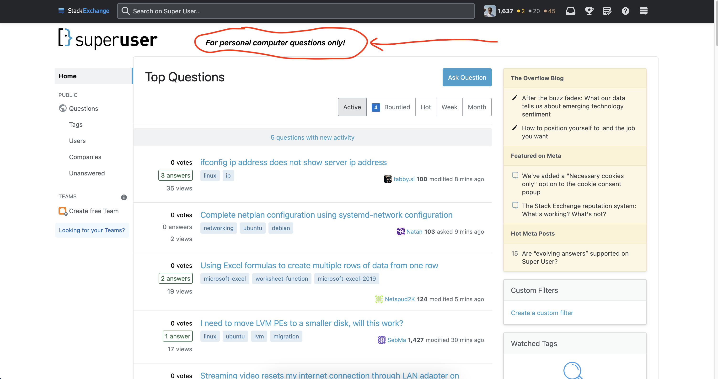
I took the screenshot that you posted in Meta SE and added a red hand drawn circle

Super User homepage manually modified with red hand drawn circle and arrow

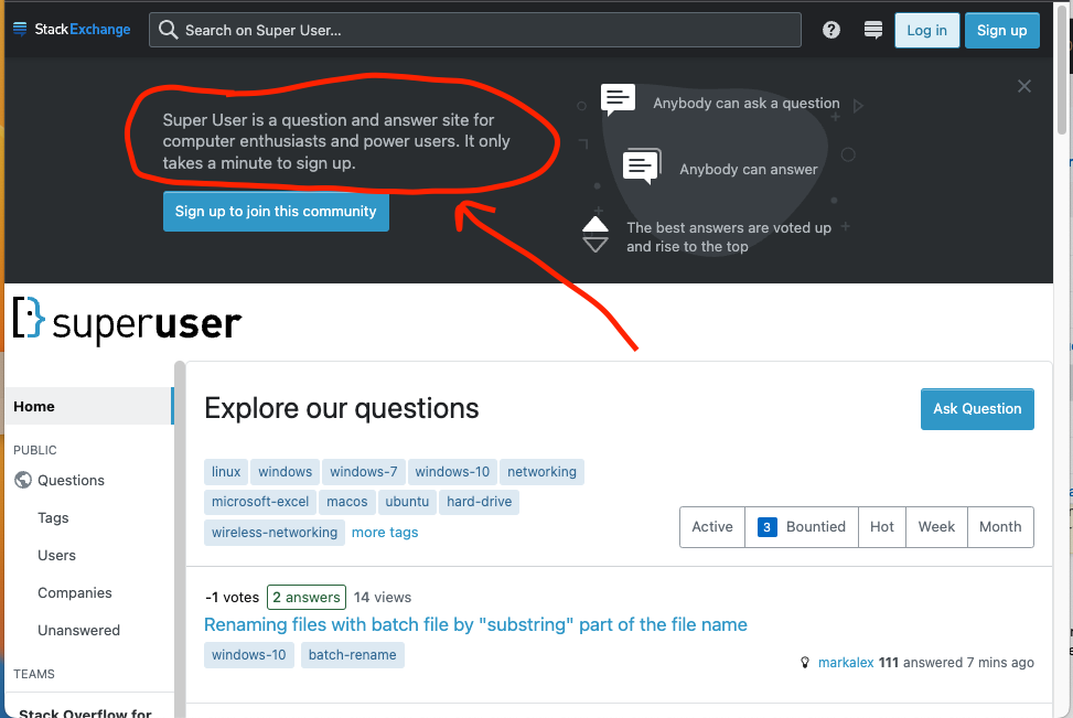
Besides the issues already mentioned in the comments, it looks that you missed that already there is a banner that is shown to anonymous users:

Welcome banner for anonymous users with red hand drawn circle and arrow

This banner has the text

Super User is a question and answer site for computer enthusiasts and power users.

The above text is also in the site Tour, the article in /help/on-topic among other places.

Many of the questions that are not a good fit for this site come from users that do just pay enough attention to post what they whant to post, they don't care about the site culture and workings at the time that they posted the question.

Some never come back, some never understand, some realize that Super User is not what they thought a others some way fix the question.

Anyway, this proposal at certain level is good enough to be discussed here, but so the current revision doesn't look to have the merits to get support from the community. You might want learn more about the culture and workings of this community.

Related

TL;DR: I'm sorry but what you are proposing doesn't look to be helpful to solve / reduce the "problem" depicted in the video / about the FAQ being too long, etc. Actually, the concept is already applied in multiple places around the site.


I took the screenshot that you posted in Meta SE and added a red hand drawn circle

Super User homepage manually modified with red hand drawn circle and arrow

Besides the issues already mentioned in the comments, it looks that you missed that already there is a banner that is shown to anonymous users:

Welcome banner for anonymous users with red hand drawn circle and arrow

This banner has the text

Super User is a question and answer site for computer enthusiasts and power users.

The above text is also in the site Tour, the article in /help/on-topic among other places.

Many of the questions that are not a good fit for this site come from users that do just pay enough attention to post what they whant to post, they don't care about the site culture and workings.

Related

TL;DR: I'm sorry but what you are proposing doesn't look to be helpful to solve / reduce the "problem" depicted in the video / about the FAQ being too long, etc. Actually, the concept is already applied in multiple places around the site.


I took the screenshot that you posted in Meta SE and added a red hand drawn circle

Super User homepage manually modified with red hand drawn circle and arrow

Besides the issues already mentioned in the comments, it looks that you missed that already there is a banner that is shown to anonymous users:

Welcome banner for anonymous users with red hand drawn circle and arrow

This banner has the text

Super User is a question and answer site for computer enthusiasts and power users.

The above text is also in the site Tour, the article in /help/on-topic among other places.

Many of the questions that are not a good fit for this site come from users that do just pay enough attention to post what they whant to post, they don't care about the site culture and workings at the time that they posted the question.

Some never come back, some never understand, some realize that Super User is not what they thought a others some way fix the question.

Anyway, this proposal at certain level is good enough to be discussed here, but so the current revision doesn't look to have the merits to get support from the community. You might want learn more about the culture and workings of this community.
Related

added 297 characters in body
Source Link
user152004
user152004

TL;DR: I'm sorry but what you are proposing doesn't look to be helpful to solve / reduce the "problem" depicted in the video / about the FAQ being too long, etc. Actually, the concept is already applied in multiple places around the site.


I took the screenshot that you posted in Meta SE and added a red hand drawn circle

enter image description hereSuper User homepage manually modified with red hand drawn circle and arrow

Besides the issues already mentioned in the comments, it looks that you missed that already there is a banner that is shown to anonymous users:

enter image description hereWelcome banner for anonymous users with red hand drawn circle and arrow

This banner has the text

Super User is a question and answer site for computer enthusiasts and power users.

The above text is also in the site Tour, the article in /help/on-topic among other places.

Many of the questions that are not a good fit for this site come from users that do just pay enough attention to post what they whant to post, they don't care about the site culture and workings.

Related

TL;DR: I'm sorry but what you are proposing doesn't look to be helpful to solve / reduce the "problem" depicted in the video / about the FAQ being too long, etc. Actually, the concept is already applied in multiple places around the site.


I took the screenshot that you posted in Meta SE and added a red hand drawn circle

enter image description here

Besides the issues already mentioned in the comments, it looks that you missed that already is a banner that is shown to anonymous users:

enter image description here

This banner has the text

Super User is a question and answer site for computer enthusiasts and power users.

The above text is also in the site Tour, the article in /help/on-topic among other places.

Related

TL;DR: I'm sorry but what you are proposing doesn't look to be helpful to solve / reduce the "problem" depicted in the video / about the FAQ being too long, etc. Actually, the concept is already applied in multiple places around the site.


I took the screenshot that you posted in Meta SE and added a red hand drawn circle

Super User homepage manually modified with red hand drawn circle and arrow

Besides the issues already mentioned in the comments, it looks that you missed that already there is a banner that is shown to anonymous users:

Welcome banner for anonymous users with red hand drawn circle and arrow

This banner has the text

Super User is a question and answer site for computer enthusiasts and power users.

The above text is also in the site Tour, the article in /help/on-topic among other places.

Many of the questions that are not a good fit for this site come from users that do just pay enough attention to post what they whant to post, they don't care about the site culture and workings.

Related

added 11 characters in body
Source Link
user152004
user152004

TL;DR: I'm sorry but what you are proposing doesn't look to be helpful to solve / reduce the "problem" depicted in the video / about the FAQ being too long, etc. Actually, the concept is already applied in multiple places around the site.


I took the screenshot that you posted in Meta SE and added a red hand drawn circle

enter image description here

Besides the issues already mentioned in the comments, it looks that you missed that already is a banner that is shown to anonymous users:

enter image description here

This banner has the text

Super User is a question and answer site for computer enthusiasts and power users.

The above text is also in the site Tour, the article in /help/on-topic among other places.

Related

TL;DR: I'm sorry but what you are proposing doesn't look to be helpful to solve / reduce the "problem" depicted in the video / about the FAQ being too long, etc. Actually, the concept is already applied in multiple places around the site.


I took the screenshot that you posted in Meta SE and added a red hand drawn circle

enter image description here

Besides the issues already mentioned in the comments, it looks that you missed that already is a banner that is shown to anonymous users:

enter image description here

This banner has the text

Super User is a question and answer site for computer enthusiasts and power users.

The above text is also in the site Tour, the /help/on-topic among other places.

Related

TL;DR: I'm sorry but what you are proposing doesn't look to be helpful to solve / reduce the "problem" depicted in the video / about the FAQ being too long, etc. Actually, the concept is already applied in multiple places around the site.


I took the screenshot that you posted in Meta SE and added a red hand drawn circle

enter image description here

Besides the issues already mentioned in the comments, it looks that you missed that already is a banner that is shown to anonymous users:

enter image description here

This banner has the text

Super User is a question and answer site for computer enthusiasts and power users.

The above text is also in the site Tour, the article in /help/on-topic among other places.

Related

Source Link
user152004
user152004
Loading