15

Related Meta Stack Overflow requests

Current status

When you flag an answer that has a very low score (and therefore appears greyed-out), the flag dialog is shown in the same faded-out colors:
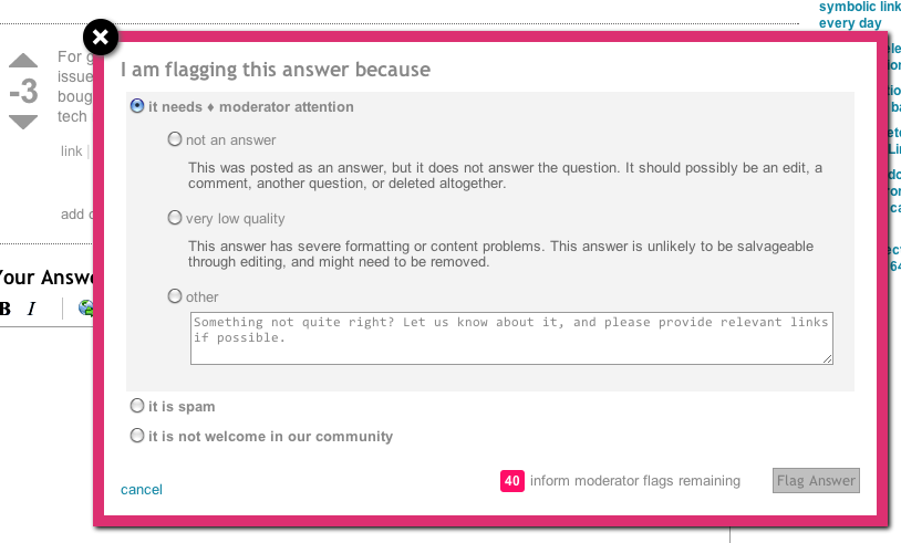
enter image description here

Obviously, that doesn't make sense.


Desired status

This is what it actually should look like:
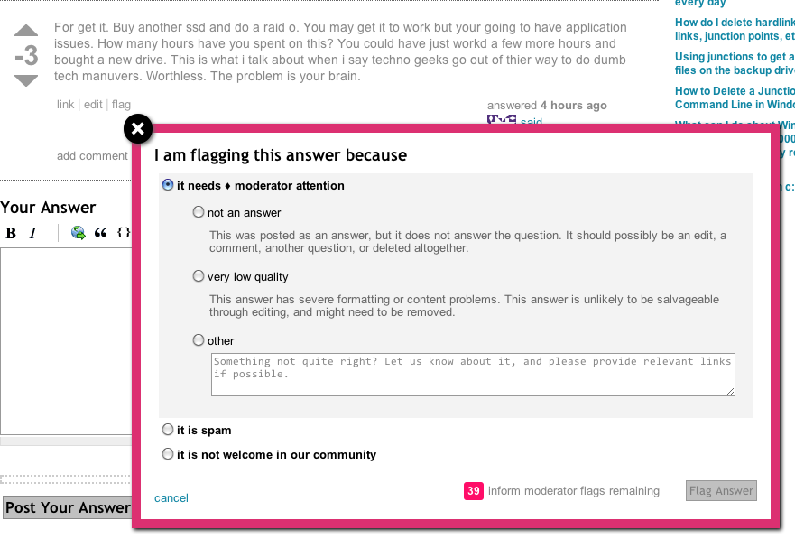
enter image description here

For those implementing, it is probably enough to set the color of the whole dialog div to black (which is what I did in my preview). But you probably know where to look at and there are a couple of other CSS properties to fix here.

3
  • 1
    You forgot to darken the "mod flags remaining" I think.
    – Hello71
    Jul 30, 2011 at 21:03
  • 1
    @Hello71 Yeah I didn't really care to make it 100% perfect, that's not my job is it :)
    – slhck
    Jul 30, 2011 at 21:13
  • I think this is something of a known problem that the pop-up incorrectly takes styling from the posting - at least two MSO posts exist on the topic.
    – DMA57361
    Aug 3, 2011 at 12:53

1 Answer 1

2

This is now - has been fixed.

As waffles said:

We were setting "color" on the top level post div, the flag was inheriting it. I changed it so we target .downvoted-answer .post-text

I just change a bunch of style sheets. This should be resloved.

Another bug was lurking ... on many SE 2.0 sites the downvoted styling was overridden. That is also fixed.

If every single stylesheet on all our sites breaks ... it is my fault

Source: https://meta.stackexchange.com/a/110817/144987

You must log in to answer this question.

Not the answer you're looking for? Browse other questions tagged .