I just noticed that the new top bar's live (looks like later today) - what should I be looking for, and what does it mean for me?
2 Answers
The mods have been using the new top bar a while, and its been active on MSE. Its a fair bit different from what you've been used to and I've found discoverability a little annoying at times - so a quick runthrough might be helpful
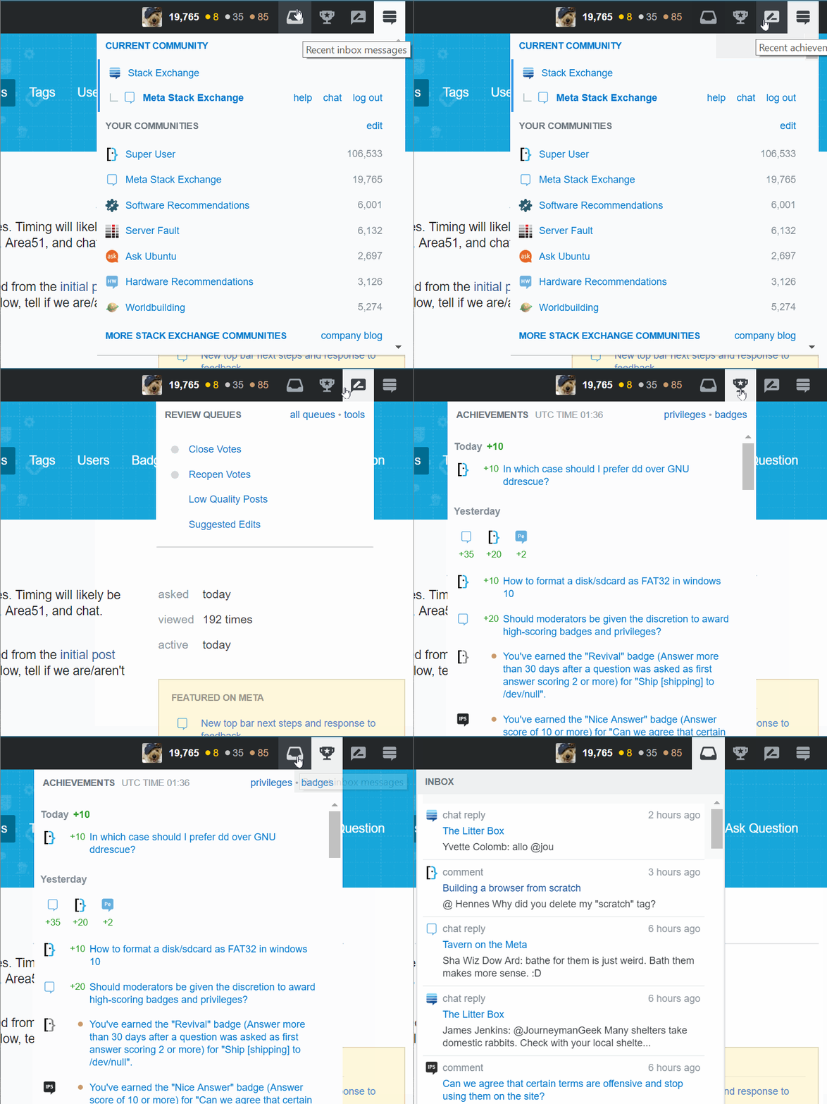
It now looks like this (for a high rep user)
compared to the old top bar.
So a quick overview? the search bar is to the centre. All the buttons have been moved to the right.
The stack exchange link is no longer a dropdown. It links to the main stackexchange page, and all your navigation is out to the right.
The new navigation options work like this. From left to right, the icons are inbox, achievements, review (the icon may change in future!) and the site switcher. For a low reputation user, you'd see review swapped out for help (as you can see here) and for higher rep users, chat and help's linked in the channel switcher.
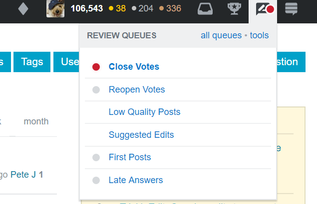
Now, there's no real review items in MSE - if there's queues that need reviews urgently it looks like this. Red means its over a threshold. Grey means there's something.
-
Also. aware the images are huge. Will resize if its an issue.– Journeyman Geek ModCommented Oct 10, 2017 at 1:44
For those who want to customise the new layout there is a user script called Stack Exchange Top Nav Choices:
Available options:
- Merge the Site Switcher with the site logo (on the left).
- Dark Top-Navigation theme on Stack Overflow and Meta Stack Overflow.
- Sticky Top-Navigation (all sites with new navigation).
- Adjust the top navigation height
- Add the help button if it's not already displayed.
- On Stack Overflow, show "Jobs" instead of "Developer Jobs".
- Apply the selected height to sites other than Stack Overflow/Meta Stack Overflow.
- Show the orange line along the top of the Top-Navigation on Stack Overflow/Meta Stack Overflow.
- Narrow the space taken by "Questions", etc. on Stack Overflow/Meta Stack Overflow.
- Change the position to left, right, or center for the drop-down menu buttons:
- Inbox
- Achievements
- Reviews
- Help
- Site Switcher
- Other (moderator tools?)
- Adjust the spacing used for the "center" drop-down position.
Example of configured top bar:
As you can see I have moved the buttons to the middle of the bar where they are more easily accessible to my muscle memory.
The dropdown at the left of the top is also the site switcher as it used to be in the old design.


