16

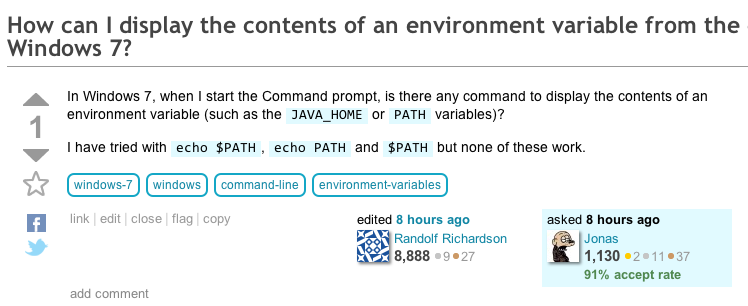
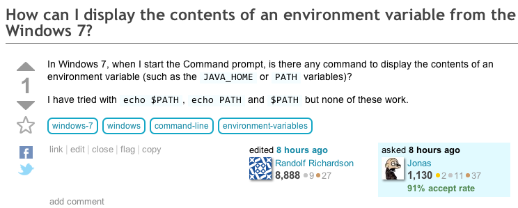
I write code or commands using "backticks". But on SuperUser, the background doesn't have much visual contrast, so if I write multiple commands separated with comma or a single word, it's hard to distinguish between the commands and the words between. If the "code/command" background color was more visible this had been more readable.

e.g. when listing commands like: command 1, command 2 and command 3.

For an example, see How can I print an environment variable from the command prompt in Windows 7?

2
  • I agree. The contrast is very low. I have worked around this by using the Stylish extension for Firefox.
    – iglvzx
    Nov 21, 2011 at 19:51
  • Thank you @Jin!
    – Daniel Beck Mod
    Jan 26, 2012 at 18:59

1 Answer 1

11

You mean this …

enter image description here

… becomes this?

enter image description here

3
  • Yes, exactly. That would be more readable.
    – Jonas
    Sep 29, 2011 at 20:19
  • 3
    Yes, the visual contrast is a bit low. It works way better on Stack Overflow.
    – slhck
    Sep 29, 2011 at 20:39
  • 3
    More! Some of us are too cheap for good IPS panels.
    – Daniel Beck Mod
    Nov 21, 2011 at 20:01

You must log in to answer this question.

Not the answer you're looking for? Browse other questions tagged .