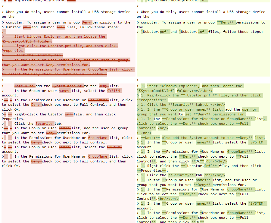
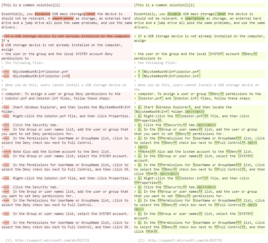
I just made this suggested edit. The comparison is wrong and incorrectly shows that I deleted a bunch of text, then added another bunch of text. This could give reviewers a wrong impression.
What I really did was just format the original bunch of text (not delete and replace it with something else). I'm looking for an improvement in the compare algorithms used, so as to show what actually happened.
The comparison page layout also doesn't match lines with lines. The text that comes after the problem text is in different vertical positions, making it more difficult to compare what changed.
Note: While my own suggested edit may be approved, I cite it here as an example to show the problems with the compare algorithm, to help improve all comparisons in general and help reviewers make a better decision.


