8

I as this because some users like to "quote" question title, while I personally use a large font bolded title for question titles:

Mine:
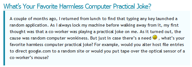
enter image description here

Tom's (not picking you out on purpose):

enter image description here

What I'm wondering is if we should come together and make sure that all of our posts are the same to preserve a sense of unity among the blog editors.

As brought up by Ivo's comment, there's also disjoin in graphs as well (which is entirely my fault). Should we template those as well? What should we template them as if so?

4
  • The same goes for graphs @Kronos
    – Ivo Flipse Mod
    Commented Apr 2, 2011 at 16:29
  • I'd verymuch prefer @Kronos's style, though I'm biased because I use the same style on my blog :)
    – Sathyajith Bhat Mod
    Commented Apr 2, 2011 at 16:30
  • @IvoFlipse I updated the question Commented Apr 2, 2011 at 16:33
  • 2
    General style guidelines and templates would be cool.
    – Mokubai Mod
    Commented Apr 2, 2011 at 16:53

1 Answer 1

1

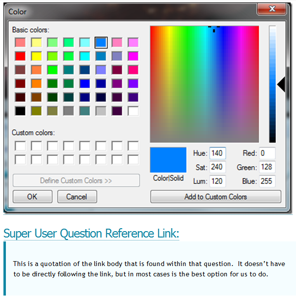
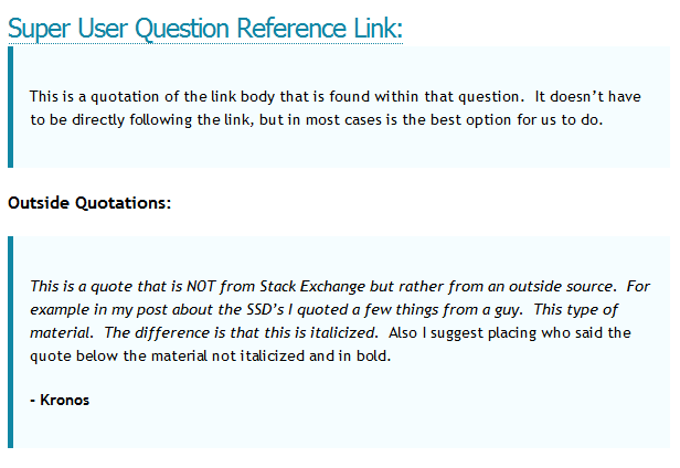
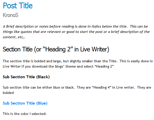
I have put together a simple outline of what I believe the blog should look like in different situations. Here is a direct link to the "preview" of the post for current blog editors. For those of you who are not current editors, but want to contribute, and make it easier for us then here are some screen shots:

enter image description here enter image description here enter image description here

If you agree with this then upvote this answer. After I get sufficient enough upvotes (6+) then I will enforce :P this template on the blog.

10
  • I agree with some thing and disagree with others, so I voted this down just for the sake of improvement and thus not disagreement: I would suggest not to use Blue for subsection titles because that color indicates that it is a link/article by itself, notice how you can click on the post title and the other blue text around the page. Using this for a subsection title would be inconsistent... For the same inconsistency reason, I think the question titles are too big if you do them like that and people could view them as headers instead which make it less clear what the different sectinos of an Commented Apr 2, 2011 at 23:25
  • article are, thus I would propose to scale them back down or to satisfy both style parties we could use a size in between (like header 4 or something similar [you can create styles I think] if that exists). The last thing I want to suggest to use a — (em dash) in citations to denote the author, and bold depending on if it still looks good (perhaps only bold the name)... Anyhow, I took my post style from @BloodPhilia because I didn't know what the style was. I thought his style was fine but apparently not, although most of your style looks fine (apart from the two suggestions) we could Commented Apr 2, 2011 at 23:30
  • try to get to a style in between. But thumbs up, I like the approach of having style guidelines to improve the consistency of our blog... :) Commented Apr 2, 2011 at 23:31
  • 3
    I dislike italicized quotes. Long blocks of italicized text are much harder to read. Perhaps we could use a different background color for SU quotes vs. outside quotes, or in some other way differentiate them, but italics are not the solution in my opinion. I find myself much less likely to read a quote if it's in all italics, because it is more difficult to do so.
    – nhinkle
    Commented Apr 3, 2011 at 8:45
  • Also, regarding graphs, I am working on a generic excel template for SU blog graphs. I will make that available once it's ready and @Kronos takes a look at it.
    – nhinkle
    Commented Apr 3, 2011 at 8:46
  • @nhinkle if your purpose of the "long italicized" comment was t prove a point... Personally I didn't even notice and it didn't bother me. One problem with different backgrounds for quotes is that it'd be difficult to implement. Commented Apr 3, 2011 at 15:27
  • @KronoS it would be easy to implement. Just create two CSS classes for <blockquote>s. I believe there's a way to add entries to the dropdown box of styles. I'm sure we could figure it out. Perhaps you find the italic text easy to read, but some people don't.
    – nhinkle
    Commented Apr 3, 2011 at 19:48
  • 2
    Can I just add that I agree with @nhinkle wrt large blocks of italic being unsightly, plus why do you need to emphasise the text when the blockquote does that already? Having different styles of blockquote sounds like a more pleasant solution to me.
    – DMA57361 Mod
    Commented Apr 4, 2011 at 7:35
  • Also just spotted a slightly odd mix of HTML for the titles; the post title and section title are h2, the sub-section titles are h4, and the question titles are h2 again... should the latter two both be h3? Or maybe sub-sections h3 and question titles h4 (so they can receive a different styling, and because the questions titles will be within the subsection, not defining a new one)? A quick glance at the CSS shows that h4's currently have no direct styling; they miss out on the reduced letter-spacing and font definitions, etc, because they simple inherit their parents styling.
    – DMA57361 Mod
    Commented Apr 4, 2011 at 7:50
  • I also agree with @nhinkle's comment wrt large italic blocks; and have already mentioned DMA's problem so I also agree with that. Commented Apr 4, 2011 at 22:45

You must log in to answer this question.

Not the answer you're looking for? Browse other questions tagged .