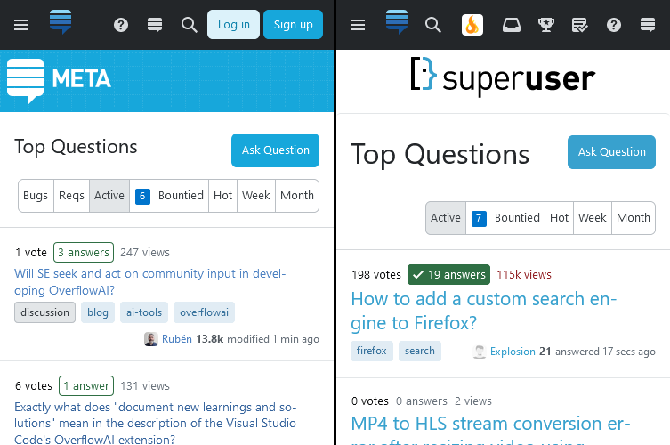
Font sizes on Super User are way to big on mobile devices (or, more specifically: viewports with widths up to 640 px). This does not affect all Stack Exchange sites, it’s a problem with the Super User theme.
The problem appears to stem from a bad interaction with the <body> font size and other elements referencing it using the rem unit.
On Meta, the font size is simply 11px. However, on Super User, it is calc(var(--su-static12) - var(--su-static1)). Dunno what’s the point, the result (when looking at calculated values) is also 11 px. Either way, the result is very different.
I can see the issue in the following environments:
- Firefox simulated mobile view (origin of screenshots above)
- Edge simulated mobile view
- Safari in iOS
I suggest sticking with a 11px here, the calc() stuff seems pointless to me.


curl, I still get the buggy version.